Angular Master Detail Router Navigation And Slide Animations
In many modern applications, for usability and user interaction or experience perspective we need to show the page in a proper manner so that the user can get the content and solve the purpose of the user journey. In such cases, sometimes left or right-side navigation helps to solve any purpose.
Adding slick animation and configuring the proper route are equally essential for any application. In this tutorial, I will explain how you can create a master details page navigation as well as add slide animation using BrowserAnimationsModule module.
First to setup Master Detail type page navigation using angular router.
Second will add another component in router module and add slide animation to it.
Setup Routes for Master Detail view
First, we need to set up some routes in our application. In this simple app, we will set a single route which is 'mat-table'. To support lazy loading, you need to follow as below.
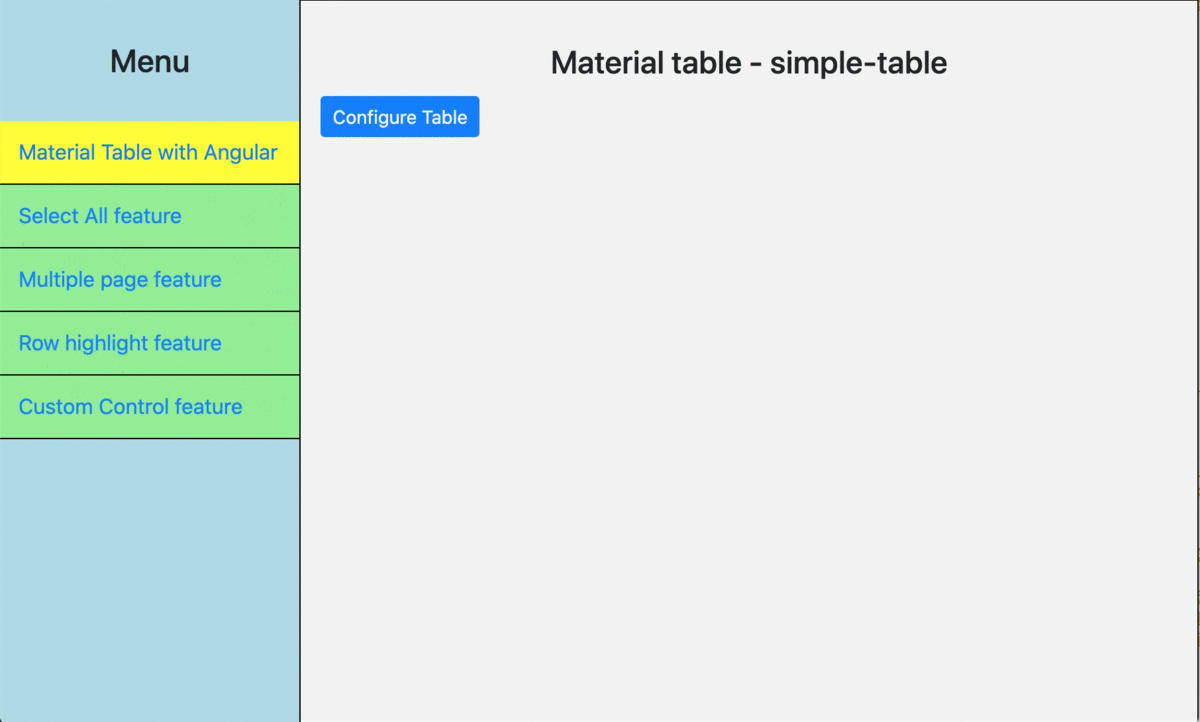
Now, let's configure the master menus and corresponding details view. For that, we need to add them to the routing tree as children's property.
You also need to set up the router-outlet accordingly so that whenever any change happens in the master menus, it should reflect on the detail page.
Slide Animation on route
Please add BrowserAnimationModule to app.module.ts file.
import { BrowserAnimationsModule } from '@angular/platform-browser/animations';
States, Transitions, and Triggers
The state is a static style definition. A transition defines how a property in the style will change. A trigger defines what action will cause one state to transition to another state.
State = What
Transition = How
Trigger = When
“animation” = Triggered transition(s) from one state to another.
Create the animations:
First create a folter '_animations' and placed the followings -
Slide-in animation creation.
Angular has some powerful pre-defined concepts in addition to the named states.
void = an element is entering or leaving the view.
* = any state
:enter and :leave are aliases for the void => * and * => void transitions.
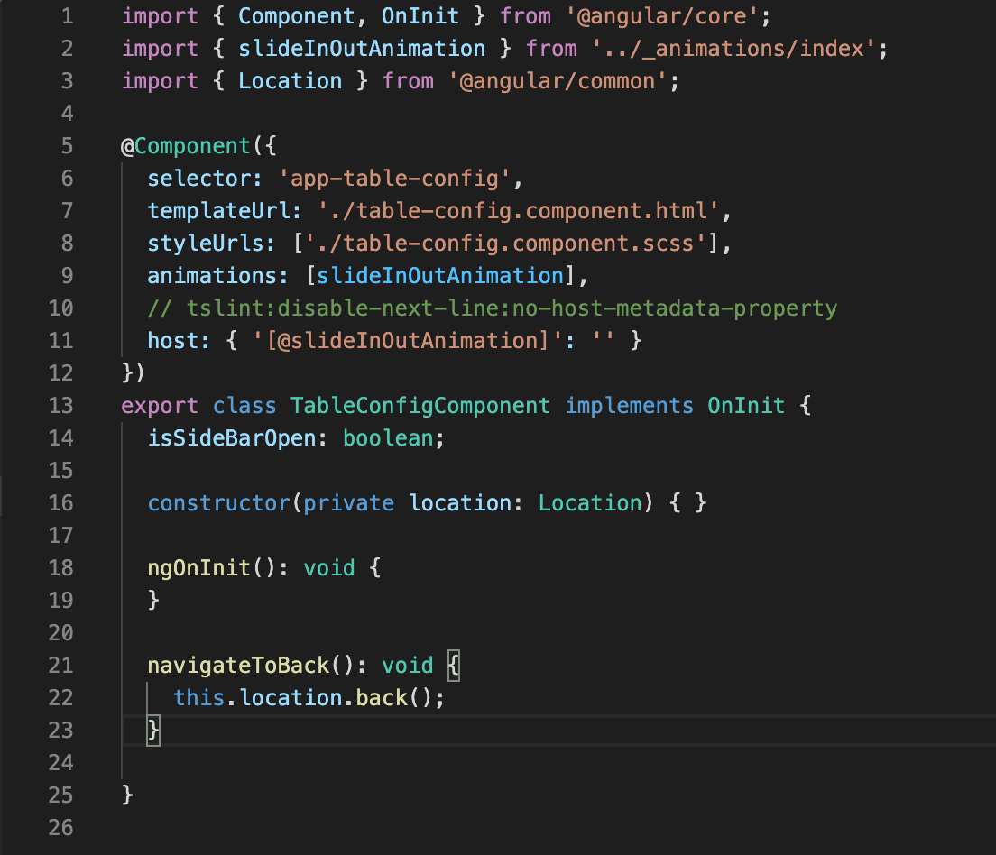
Now you are almost ready to use the animation. But before you start please make the following changes to your component file as well.
Now, you are ready to run the application. You can find the complete code from here.
Happy Coding!
Thanks,
Lazy Panda
Loading comments...